Cloud & Cuckoo
Brand Identity & Packaging
Creative Direction / Copywriting / Art Direction / Packaging Design / Artwork / Photography
Brief
Customers are either looking for something hand-made or they buy from established brands. We’re having trouble scaling, and we want to build the kind of credibility we can take overseas
The opportunity
Cloud & Cuckoo had a lovely ‘designed by mum’ story that worked well at trade fairs using emotional buy-in to secure orders, but with plans to take business overseas they needed a convincing high-end product. I repositioned Cloud & Cuckoo as an ethically responsible designer brand ready to help parents navigate early childhood.
In our brand evaluation, we identified the need to move away from hand drawn elements to connect with a new wave of ethically conscious parents, mostly fitting within the affluent millennial group.
We took inspiration from leading sustainable luxury products and stripped back the more childlike elements of the design, focussing on effortless communication and a minimal aesthetic. We replaced the hand drawn logo with strong, minimalist lettering that could be easily read by second language readers, incorporating owner & designer Jenna’s Cuckoo illustration to add some individuality and ownership.
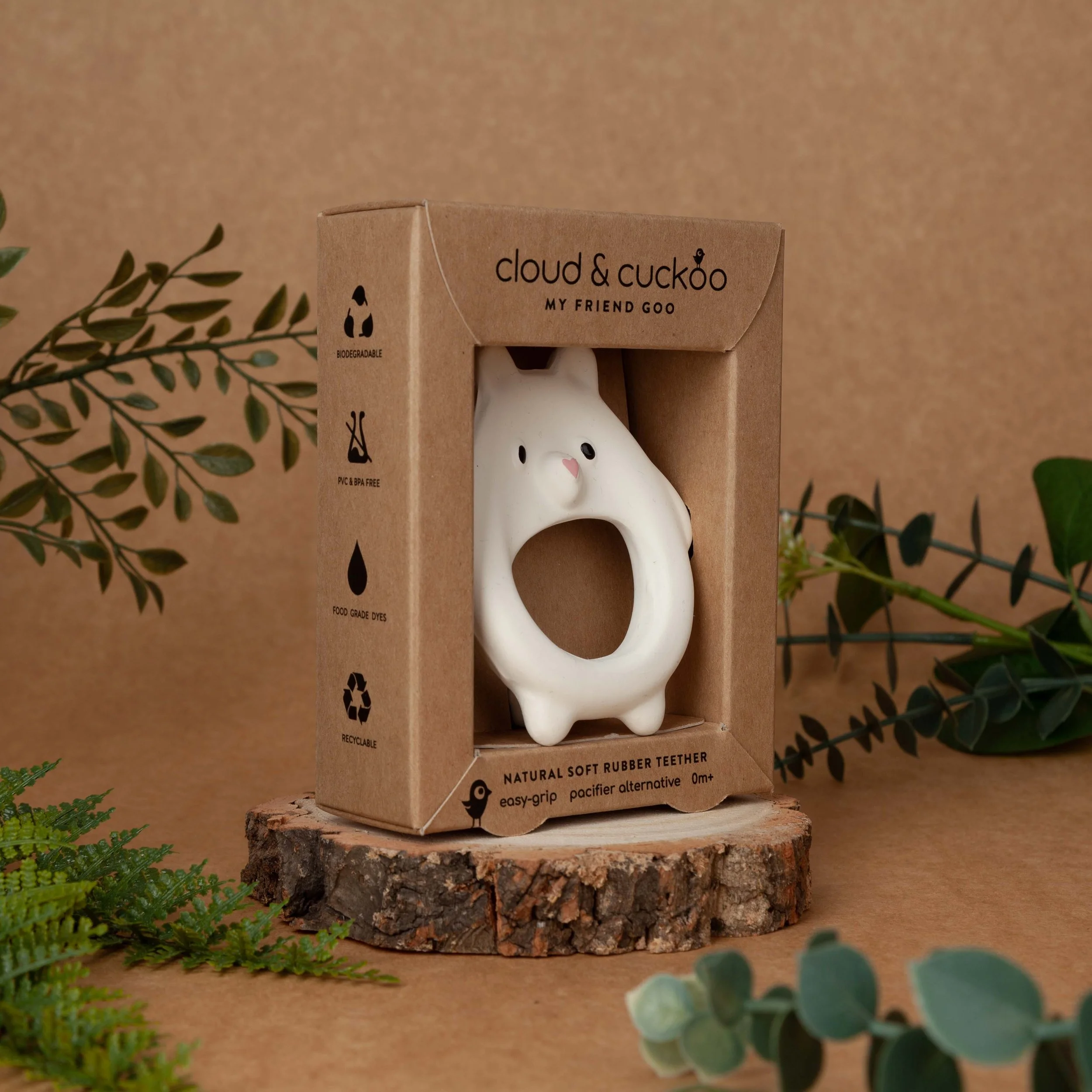
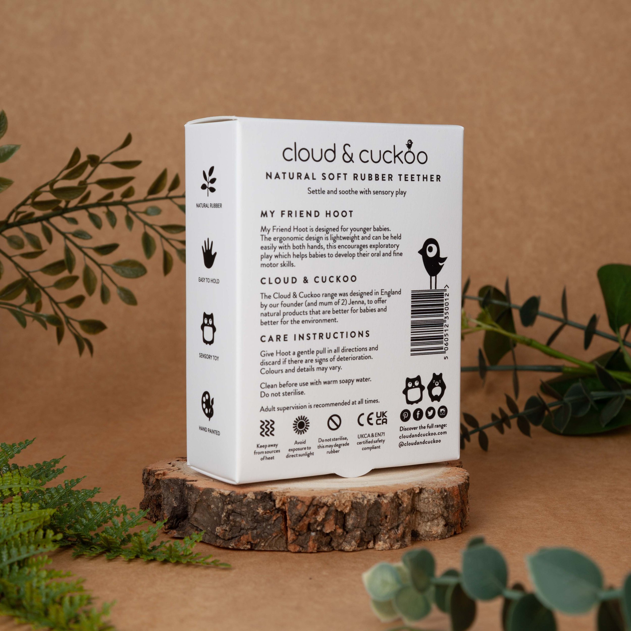
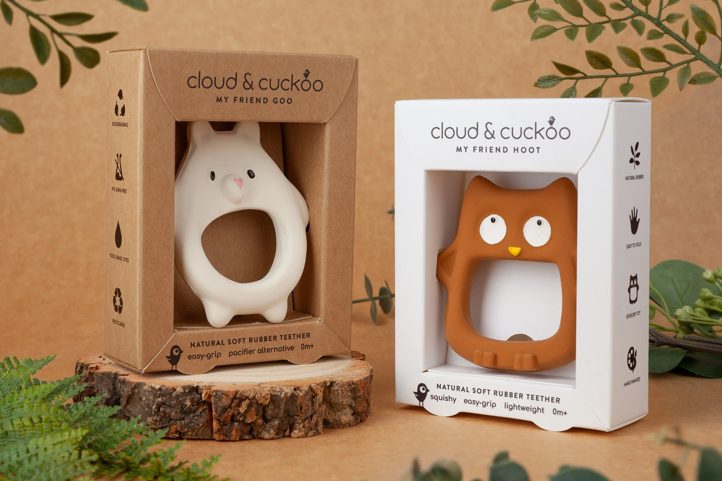
For the packaging, the most important thing to achieve was the sustainability credentials. Ditching the plastic was the first priority, which meant designing a structure that offered enough visibility, protection and security to suit a retail environment while also making an impressive baby gift.
The new minimalist packaging wordlessly communicates the brand’s commitment to sustainability and natural products, while letting the products take centre stage.
Before: