Baileys Creams
Masterbrand Interpretation & Product Relaunch
Packaging Design / Creative Artwork / Photography
The brief
We want to relaunch our licenced Bailey’s creams to bring them in line with the new Masterbrand guidelines, to give our creams the mouth-watering impact they deserve.
The opportunity
Most of the Bailey’s licensed range includes indulgence and celebration products, and the guidelines suggest the inclusion of patterns and suggested serve illustrations to make the designs dynamic and delicious looking.
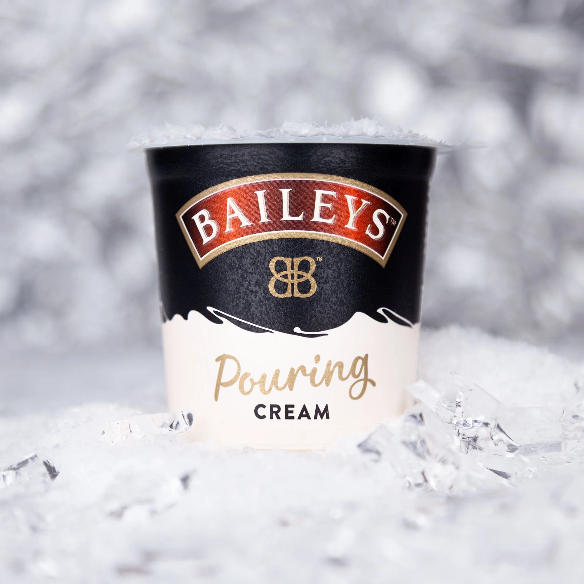
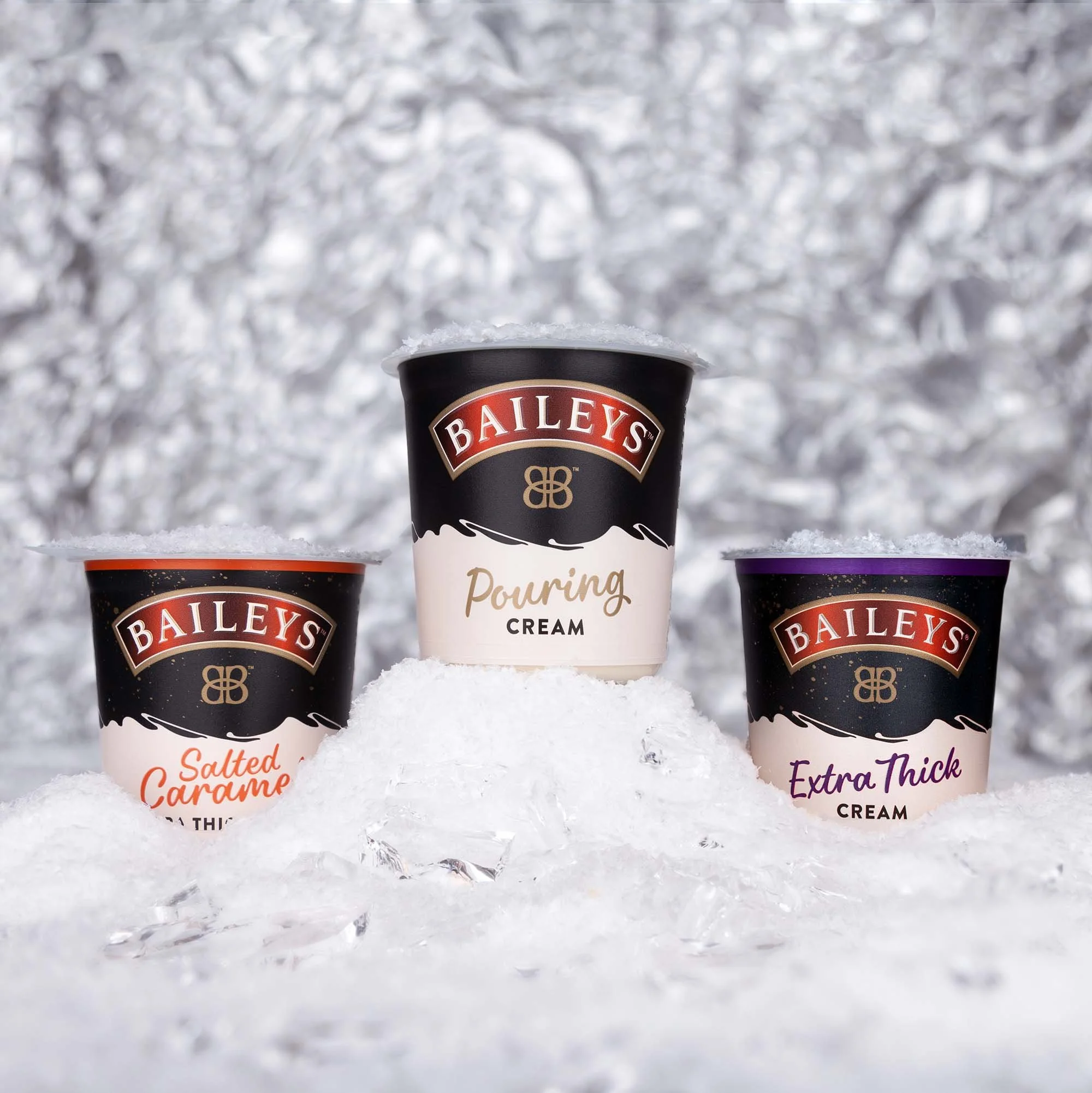
Unlike many of the other products, I was lucky to be branding a product close to the original: Baileys Irish Cream… Cream. Rather than opting for busy graphics with suggested serve images I chose to keep it simple, using black & cream and an illustrated drizzle to create a classic, classy product that could sit pretty on the Christmas dinner table as a matter of pride. As a seasonal product, the range of three flavours includes a flavoured and an extra thick variant, which I differentiated from the classic all-season product with a key colour and a little seasonal sparkle.
Before: